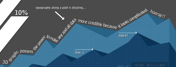
Is the infographic craze over yet? Can we move on now? We progressed from vague intrigue to rapidly hitting the “x” button to get the marketing gibberish shouting meaningless numbers off the screen as quickly as humanly possible.
“Chart junk” is a term coined by Edward Tufte, the leading expert in data visualization and information design. Thanks to Stokefire, I had the pleasure of participating in his one day course, which was a sold out seminar packed to the brim with about 500 people.
The class started with an hour of assigned reading from his four books, which together comprise one of the most successful self publishing stints in history. He shared with us how people can read two to three times faster than you can talk. Even if you’re a trained auctioneer, its best to start your meetings with 5-10 minutes of reading a white paper or report. That way everyone starts fully briefed and the rest of the time can be used to elaborate, discuss or brainstorm. Don’t be tempted to send the paper to your coworkers prior, they are busy just like you and have already dedicated meeting time to your issue – take advantage of this undivided attention. This is the best way to cut the length of any meeting by at least 20%.
Mr. Tufte has great respect for people, definitely more than any Powerpoint presenter has ever displayed. Audiences are smart and capable of absorbing huge amounts of information at once. With this in mind, it is best to make your designs as streamlined and flat as possible. Not flat as in the latest design trend, but vigilant in avoiding breaking out or hiding information. Nobody wants to search for figure 1.7 on page 3.
Say you have a table of universities with their associated math test scores – it is worthless to arrange them in alphabetical order. With every chart you create an opportunity is present to display the information meaningfully, e.g: ranking the schools from best to worst. People will quickly scan to find the school they’re interested in but they have also learned something new in the process.
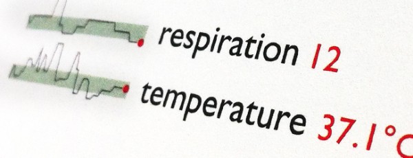
The thing that struck me most was how much information Mr. Tufte could fit in the space of one line of words. He is the inventor of sparklines, which are tiny charts conveying huge amounts of data displayed inline with text. They display general trends of (usually time based) information quickly and efficiently without breaking the flow of a sentence. The benefit this snapshot provides is that the general trend of the previously collected information gives context to the current measurement. Mr. Tufte describes sparklines as “data words: data-intense, design-simple, word-sized graphics.” They have already been adopted by financial, sports, and technology institutions, and I hope that I start seeing my medical charts looking like this sooner than later.

“It is better to be roughly right than precisely wrong.”
– John Mayhand
No chart junk here!
This post is also on Stokefire’s blog.
