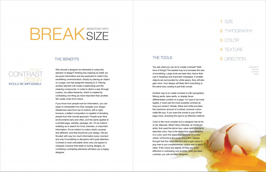
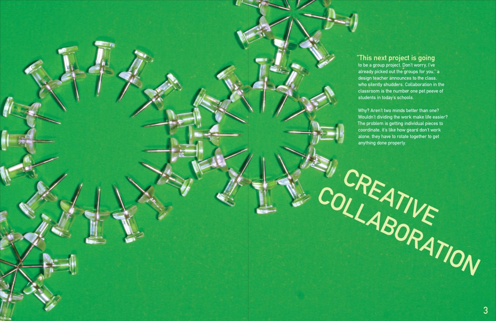
These two spreads were a part of a larger magazine whose focus was on teaching design principles to students. I researched the content, wrote the articles, took all the photography and laid out the spreads. The first article teaches students how to create contrast in their design, stating that design and contrast are inseparable beings and to have one, you must have the other. The second article discusses how to collaborate successfully with other designers.
Writing, design, and photography are my own.


